Since the large tables in the above references are hard to read, I decided to plot the quantities to see if there were any patterns.
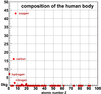
On the right is the mass per element in kg versus the atomic number, from 1=Hydrogen to 92=Uranium, for a 70-kg man. You can immediately see that there are only a few that make up most of your body: Hydrogen, Carbon and Oxygen. Hydrogen and Oxygen of course make water, in which the organic chemistry of life takes place. The backbone of all organic molecules is made from Carbon atoms, and everything else is just decoration.
After these three,
only Nitrogen(7), Phosphorus(15) and Calcium(20) are noticably different from zero in this
graph. Everything else occurs in minuscule amounts compared to these six. Of course that
doesn't necessarily mean they are not important.
(root script for this plot)
Try it ----->
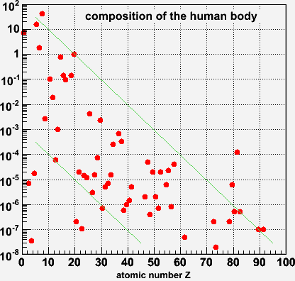
On this scale you can see what happens to the trace elements. The data span 10 orders of magnitude, from ~100 kg down to ~10 nanograms
The lines are just to guide the eye, but it appears that there is a broad pattern such that abundance falls exponentially with Z. There are several points that stick out:
On the low-Z end there are of course Hydrogen, Carbon, Oxygen that are very abundant as noted before. On the high-Z end, Mercury(89) and Lead(92) are 10 to 100 times more abundant than you'd expect from the overall pattern. I am pretty sure this is a sign of chemical pollution - I bet this is not what you'd see for a 70-kg man who grew up in a non-industrial environment.
Below the lower green line we see Lithium(3), Beryllium(4) and Boron(5) are unusually low. This has to do with the nuclear physics of how these elements are cooked up inside of stars like our sun.
A little further up Scandium(21) and Vanadium(23) appear lower in abundance than
their neighbors.
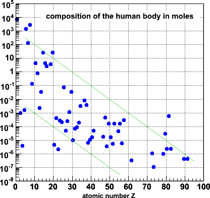
In this blue version, the abundances are recalculated in moles. The overall
pattern is of course the same, except that the distribution now spans a larger
vertical range (by a factor ~238 of course).
The pattern seen in the distribution of elements in the human body is striking,
but maybe not surprising. Heavy elements are rarer than lighter ones, right? After
all, when the elements are built, you have to fuse lighter elements, which would lead to
such a pattern, and heavier elements (above 26) are built bit by bit by adding neutrons,
which might also be harder and harder as you work your way up.
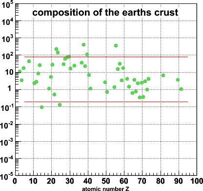
So I went and looked for the distribution of elements on the surface of the earth. I found this site by Dr. B.M.Gunn, and made this plot. Not at all what I expected!
The lines are again just to guide the eye, but clearly this is not the same pattern as we saw for the human body.
You can also play with this plot: if you put your cursor over the dots, your browser will tell you what the element is. If you then click, you will go to a page at Everything2.com with details about this element.
Try it ----->
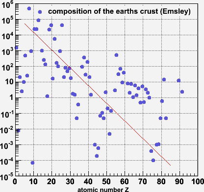
This distribution of elements comes again from Emsley's 'the Elements' book from which we got the numbers for the human body. Again, this shows a broad falling exponential pattern.
Why the difference with Gunn's numbers? Don't know (yet). Also, I find the clumping of data between Z=60-73 a bit suspicious.
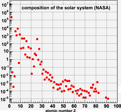
The next scale up is the solar system. I found these numbers on this NASA site. I don't even have to draw a line here to guide the eye.
